Overview
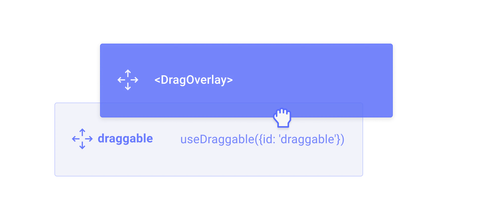
TheDragOverlay component renders a custom overlay element while a drag operation is in progress. This allows you to display a completely different element than the one being dragged, which is useful for rendering a styled clone, a preview, or a simplified representation of the dragged element.
Usage
Import and place theDragOverlay component inside a DragDropProvider. Its children will only be rendered when a drag operation is active.
Rendering based on the drag source
To get around the fact that theDragOverlay component should only be rendered once, you can pass a function as a child, which will receive the source as an argument. This is useful for rendering different content depending on which element is being dragged.
Customizing the drop animation
By default, when a drag operation ends, the overlay animates back to the position of the source element. You can customize or disable this animation using thedropAnimation prop.
Props
The content to render as the drag overlay. Only rendered when a drag operation is in progress. Can be a React node or a function that receives the drag
source as an argument.The HTML tag to render as the overlay wrapper element.
Whether the drag overlay is disabled. Can be a boolean or a function that receives the current drag source.
Customize or disable the drop animation that plays when a drag operation ends.
undefined– use the default animation (250msease)null– disable the drop animation entirely{duration, easing}– customize the animation timing(context) => Promise<void> | void– provide a fully custom animation function
CSS class name for the overlay wrapper element.
Inline styles for the overlay wrapper element.