> ## Documentation Index
> Fetch the complete documentation index at: https://dnd-kit-claude-busy-bouman.mintlify.app/llms.txt
> Use this file to discover all available pages before exploring further.
# Quickstart
> Eager to get started? This quick start guide will help you familiarize yourself with the core concepts of dnd kit.
Before getting started, make sure you have followed the installation steps outlined in the [Installation guide](./installation).
### Context provider
First, we'll set up the general structure of the app. In order for the [`useDraggable`](../api-documentation/draggable/use-draggable) and [`useDroppable`](../api-documentation/droppable/use-droppable) hooks to function correctly, you'll need to ensure that the components where they are used are wrapped within a [``](../api-documentation/context-provider/dnd-context) component:
```jsx App.jsx theme={null}
import React from 'react';
import {DndContext} from '@dnd-kit/core';
import {Draggable} from './Draggable';
import {Droppable} from './Droppable';
function App() {
return (
);
}
```
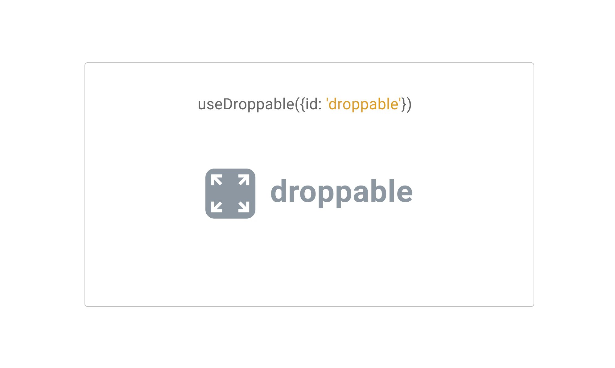
### Droppable
Next, let's set up your first **Droppable** component. To do so, we'll be using the `useDroppable` hook.\
\
The `useDroppable` hook isn't opinionated about how your app should be structured. At minimum though, it requires you pass a [ref](https://reactjs.org/docs/refs-and-the-dom.html) to the DOM element that you would like to become droppable. You'll also need to provide a unique `id` attribute to all your droppable components.
When a **draggable** element is moved over your droppable element, the `isOver` property will become true.
```jsx Droppable.jsx theme={null}
import React from 'react';
import {useDroppable} from '@dnd-kit/core';
function Droppable(props) {
const {isOver, setNodeRef} = useDroppable({
id: 'droppable',
});
const style = {
color: isOver ? 'green' : undefined,
};
return (
{props.children}
);
}
```
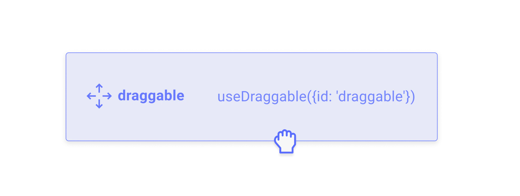
### Draggable
Next, let's take a look at implementing our first **Draggable** component. To do so, we'll be using the `useDraggable` hook.
The `useDraggable` hook isn't opinionated about how your app should be structured. It does however require you to be able to attach listeners and a ref to the DOM element that you would like to become draggable. You'll also need to provide a unique `id` attribute to all your draggable components.
After a draggable item is picked up, the `transform` property will be populated with the `translate` coordinates you'll need to move the item on the screen.
The `transform` object adheres to the following shape: `{x: number, y: number, scaleX: number, scaleY: number}`
```jsx Draggable.jsx theme={null}
import React from 'react';
import {useDraggable} from '@dnd-kit/core';
function Draggable(props) {
const {attributes, listeners, setNodeRef, transform} = useDraggable({
id: 'draggable',
});
const style = transform
? {
transform: `translate3d(${transform.x}px, ${transform.y}px, 0)`,
}
: undefined;
return (
);
}
```
As you can see from the example above, it really only takes just a few lines to transform your existing components into draggable components.
**Tips:**
* For performance reasons, we recommend you use **`transform`** over other positional CSS properties to move the dragged element.
* You'll likely want to alter the **`z-index`** of your Draggable component to ensure it appears on top of other elements.
* If your item needs to move from one container to another, we recommend you use the [``](../api-documentation/draggable/drag-overlay) component.
Converting the `transform` object to a string can feel tedious. Fear not, you can avoid having to do this by hand by importing the `CSS` utility from the `@dnd-kit/utilities` package:
```jsx theme={null}
import {CSS} from '@dnd-kit/utilities';
// Within your component that receives `transform` from `useDraggable`:
const style = {
transform: CSS.Translate.toString(transform),
};
```
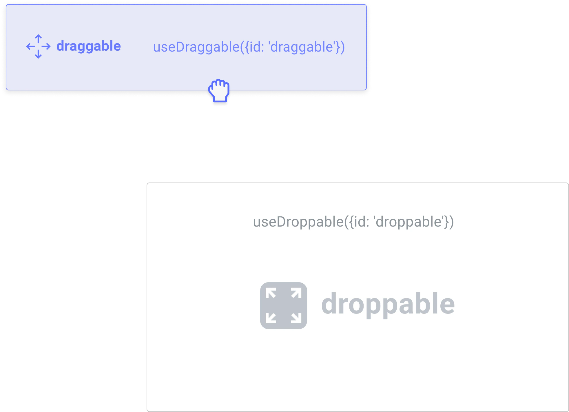
### Assembling all the pieces
Once you've set up your **Droppable** and **Draggable** components, you'll want to come back to where you set up your [``](../api-documentation/context-provider/) component so you can add event listeners to be able to respond to the different events that are fired.
In this example, we'll assume you want to move your `` component from outside into your `` component:
To do so, you'll want to listen to the `onDragEnd` event of the `` to see if your draggable item was dropped over your droppable:
```jsx App.jsx theme={null}
import React, {useState} from 'react';
import {DndContext} from '@dnd-kit/core';
import {Droppable} from './Droppable';
import {Draggable} from './Draggable';
function App() {
const [isDropped, setIsDropped] = useState(false);
const draggableMarkup = Drag me;
return (
{!isDropped ? draggableMarkup : null}
{isDropped ? draggableMarkup : 'Drop here'}
);
function handleDragEnd(event) {
if (event.over && event.over.id === 'droppable') {
setIsDropped(true);
}
}
```
```jsx Droppable.jsx theme={null}
import React from 'react';
import {useDroppable} from '@dnd-kit/core';
export function Droppable(props) {
const {isOver, setNodeRef} = useDroppable({
id: 'droppable',
});
const style = {
color: isOver ? 'green' : undefined,
};
return (
{props.children}
);
}
```
```jsx Draggable.jsx theme={null}
import React from 'react';
import {useDraggable} from '@dnd-kit/core';
export function Draggable(props) {
const {attributes, listeners, setNodeRef, transform} = useDraggable({
id: 'draggable',
});
const style = transform
? {
transform: `translate3d(${transform.x}px, ${transform.y}px, 0)`,
}
: undefined;
return (
);
}
```
That's it! You've set up your first [**Droppable**](../api-documentation/droppable) \*\*\*\* and [\*\*Draggable\*\*](../api-documentation/draggable) components.
### Pushing things a bit further
The example we've set up above is a bit simplistic. In a real world example, you may have multiple droppable containers, and you may also want to be able to drag your items back out of the droppable containers once they've been dragged within them.
Here's a slightly more complex example that contains multiple **Droppable** containers:
```jsx App.jsx theme={null}
import React, {useState} from 'react';
import {DndContext} from '@dnd-kit/core';
import {Droppable} from './Droppable';
import {Draggable} from './Draggable';
function App() {
const containers = ['A', 'B', 'C'];
const [parent, setParent] = useState(null);
const draggableMarkup = Drag me;
return (
{parent === null ? draggableMarkup : null}
{containers.map((id) => (
// We updated the Droppable component so it would accept an `id`
// prop and pass it to `useDroppable`
{parent === id ? draggableMarkup : 'Drop here'}
))}
);
function handleDragEnd(event) {
const {over} = event;
// If the item is dropped over a container, set it as the parent
// otherwise reset the parent to `null`
setParent(over ? over.id : null);
}
}
```
```jsx Droppable.jsx theme={null}
import React from 'react';
import {useDroppable} from '@dnd-kit/core';
export function Droppable(props) {
const {isOver, setNodeRef} = useDroppable({
id: props.id,
});
const style = {
color: isOver ? 'green' : undefined,
};
return (
{props.children}
);
}
```
```jsx Draggable.jsx theme={null}
import React from 'react';
import {useDraggable} from '@dnd-kit/core';
export function Draggable(props) {
const {attributes, listeners, setNodeRef, transform} = useDraggable({
id: props.id,
});
const style = transform
? {
transform: `translate3d(${transform.x}px, ${transform.y}px, 0)`,
}
: undefined;
return (
);
}
```
We hope this quick start guide has given you a glimpse of the simplicity and power of @dnd-kit. There's much more to learn, and we encourage you to keep reading about all of the different options you can pass to `` , `useDroppable` and `useDraggable` by reading their respective API documentation.
 Next, let's set up your first **Droppable** component. To do so, we'll be using the `useDroppable` hook.\
\
The `useDroppable` hook isn't opinionated about how your app should be structured. At minimum though, it requires you pass a [ref](https://reactjs.org/docs/refs-and-the-dom.html) to the DOM element that you would like to become droppable. You'll also need to provide a unique `id` attribute to all your droppable components.
When a **draggable** element is moved over your droppable element, the `isOver` property will become true.
```jsx Droppable.jsx theme={null}
import React from 'react';
import {useDroppable} from '@dnd-kit/core';
function Droppable(props) {
const {isOver, setNodeRef} = useDroppable({
id: 'droppable',
});
const style = {
color: isOver ? 'green' : undefined,
};
return (
Next, let's set up your first **Droppable** component. To do so, we'll be using the `useDroppable` hook.\
\
The `useDroppable` hook isn't opinionated about how your app should be structured. At minimum though, it requires you pass a [ref](https://reactjs.org/docs/refs-and-the-dom.html) to the DOM element that you would like to become droppable. You'll also need to provide a unique `id` attribute to all your droppable components.
When a **draggable** element is moved over your droppable element, the `isOver` property will become true.
```jsx Droppable.jsx theme={null}
import React from 'react';
import {useDroppable} from '@dnd-kit/core';
function Droppable(props) {
const {isOver, setNodeRef} = useDroppable({
id: 'droppable',
});
const style = {
color: isOver ? 'green' : undefined,
};
return (
 Next, let's take a look at implementing our first **Draggable** component. To do so, we'll be using the `useDraggable` hook.
The `useDraggable` hook isn't opinionated about how your app should be structured. It does however require you to be able to attach listeners and a ref to the DOM element that you would like to become draggable. You'll also need to provide a unique `id` attribute to all your draggable components.
After a draggable item is picked up, the `transform` property will be populated with the `translate` coordinates you'll need to move the item on the screen.
The `transform` object adheres to the following shape: `{x: number, y: number, scaleX: number, scaleY: number}`
```jsx Draggable.jsx theme={null}
import React from 'react';
import {useDraggable} from '@dnd-kit/core';
function Draggable(props) {
const {attributes, listeners, setNodeRef, transform} = useDraggable({
id: 'draggable',
});
const style = transform
? {
transform: `translate3d(${transform.x}px, ${transform.y}px, 0)`,
}
: undefined;
return (
);
}
```
As you can see from the example above, it really only takes just a few lines to transform your existing components into draggable components.
Next, let's take a look at implementing our first **Draggable** component. To do so, we'll be using the `useDraggable` hook.
The `useDraggable` hook isn't opinionated about how your app should be structured. It does however require you to be able to attach listeners and a ref to the DOM element that you would like to become draggable. You'll also need to provide a unique `id` attribute to all your draggable components.
After a draggable item is picked up, the `transform` property will be populated with the `translate` coordinates you'll need to move the item on the screen.
The `transform` object adheres to the following shape: `{x: number, y: number, scaleX: number, scaleY: number}`
```jsx Draggable.jsx theme={null}
import React from 'react';
import {useDraggable} from '@dnd-kit/core';
function Draggable(props) {
const {attributes, listeners, setNodeRef, transform} = useDraggable({
id: 'draggable',
});
const style = transform
? {
transform: `translate3d(${transform.x}px, ${transform.y}px, 0)`,
}
: undefined;
return (
);
}
```
As you can see from the example above, it really only takes just a few lines to transform your existing components into draggable components.
 To do so, you'll want to listen to the `onDragEnd` event of the `